Styleguide.
The tokens, type and parts every Ombrelle page is built from. Toggle the theme in the header to see each one in carbon.
- Geist + Geist Mono
- 15 color tokens
- Bone + carbon
- 53 CC0 photos
- Tailwind 4
Color
Bone neutrals, one signal orange and five image placeholder tones. Each swatch shows the light value on the left and the dark value on the right.
app/globals.css · tokens/ombrelle.tokens.json- paper
--o-paper- Light
- #f2f1ed
- Dark
- #0b0b0a
- paper-2
--o-paper-2- Light
- #e8e7e2
- Dark
- #141413
- card
--o-card- Light
- #ffffff
- Dark
- #181817
- ink
--o-ink- Light
- #0d0d0c
- Dark
- #f2f1ed
- muted
--o-muted- Light
- #64635e
- Dark
- #a3a29c
- subtle
--o-subtle- Light
- #9c9a93
- Dark
- #6e6d68
- line
--o-line- Light
- #dddcd6
- Dark
- #262624
- line-strong
--o-line-strong- Light
- #c5c3bc
- Dark
- #3a3a37
- accent
--o-accent- Light
- #ff4f1f
- Dark
- #ff6a3d
- accent-fg
--o-accent-fg- Light
- #0d0d0c
- Dark
- #0b0b0a
- plate-1
--o-plate-1- Light
- #e3e1da
- Dark
- #bfbcb4
- plate-2
--o-plate-2- Light
- #c9c6bc
- Dark
- #a5a298
- plate-3
--o-plate-3- Light
- #a29e92
- Dark
- #87837a
- plate-4
--o-plate-4- Light
- #625f57
- Dark
- #4e4c46
- plate-5
--o-plate-5- Light
- #272623
- Dark
- #1e1d1b
Use them as Tailwind classes only: bg-paper bg-card text-ink text-muted border-line bg-accent text-accent-fg and opacity modifiers. White and black appear only on image overlays.
Themes
Light (bone) is the default; the dark (carbon) theme is the .dark class on <html>, saved in localStorage as theme.
:root · .dark · app/layout.tsx:rootShaped by light.
Casa do Arco
Comporta · 2025
.darkShaped by light.
Casa do Arco
Comporta · 2025
Type scale
One family. Geist for everything, big and tight at the top; Geist Mono only for small uppercase labels.
app/globals.css → @layer utilities- Hero
.text-heroGeist 600 · clamp(52px, 11.5vw, 176px) · 0.86 · −0.065emPage titlesLight.
- Display
.text-displayGeist 600 · clamp(40px, 6.4vw, 96px) · 0.92 · −0.055emSection titlesLime and timber.
- Headline
.text-headlineGeist 600 · clamp(30px, 3.6vw, 52px) · 1.0 · −0.045emSub-sections, quotesThresholds, stairs and long windows
- Title
.text-titleGeist 600 · 24px · 1.1 · −0.035emCard titlesCasa do Arco, Comporta
- Heading
.text-headingGeist 600 · 19px · 1.25 · −0.025emSmall headings, list rowsLime plaster, smoked oak, basalt
- Lede
.text-ledeGeist 450 · clamp(19px, 1.7vw, 24px) · 1.4 · −0.02emIntro paragraphsWe design buildings and rooms that slow people down, places that hold the light and age well.
- Body
bodyGeist 400 · 15px · 24pxDefault on <body>A low house arranged around a single arched threshold that frames the pines. Lime plaster walls, oak floors and a roof of handmade tiles.
- Label
.text-labelGeist Mono 500 · 11px · 16px · 0.06em · uppercaseChips, meta, indices01 · Residential · 2025
Emphasis is a second tone, never a second typeface: Shaped by light. Big numbers use font-semibold tracking-[-0.07em].
Radii
Two shape tokens carry the whole kit, plus pills and the 24px glass radius.
@theme --radius-tile · --radius-panel- Tile20px
--radius-tile · .tile / rounded-tileImages, swatches, small cards - Panel32px
--radius-panel · .panel / rounded-panelLarge images, cards, feature tiles - Glass24px
rounded-3xlGlass overlays, FAQ rows, modal - Pill9999px
rounded-fullButtons, chips, tabs, header bar
Form fields
Rounded filled fields, 48px tall, with a label above and an optional hint below. Always pair id and htmlFor.
components/ui/field.tsxBadges
Small status labels. Add a dot so state never relies on color alone.
components/ui/badge.tsxChips
Mono label chips: a section chip with an accent dot, a meta chip, and frosted chips over images.
Pattern · rounded-full + .text-label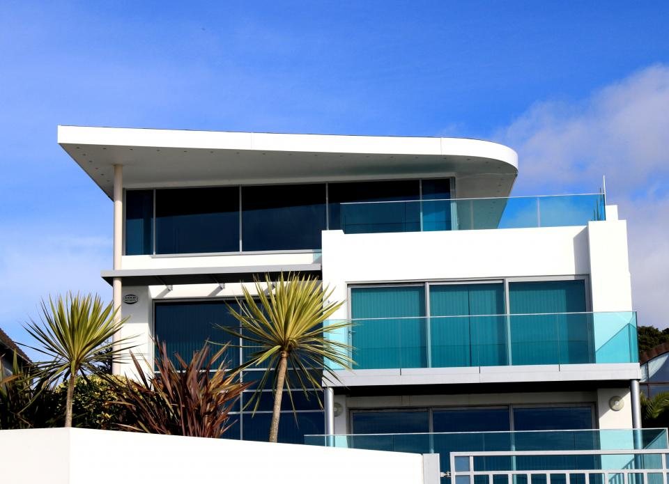 01 · Residential
Tabs
Segmented pill tabs with optional counts and arrow-key navigation.
components/ui/tabs.tsx · data-tabsEvery project, newest first. Move between tabs with the arrow keys.
Houses and apartments, from Comporta to Porto.
A museum of light and a library for the square.
Switch
A binary setting that applies immediately. Give it a visible label.
components/ui/switch.tsx · data-switchCaptions: on
Modal
A native dialog for short, focused tasks that must not lose the page behind them.
components/ui/modal.tsxPhotography
53 royalty-free CC0 photographs, free for commercial use with no attribution (sources in docs/CREDITS.md). Pick one by name; the box sets the crop.
components/ui/plate.tsx · public/images/Swap the photos
Replace a file in public/images/ with your own photograph under the same name, or point a name in PHOTOS at a new file. Layouts, crops and captions stay as they are.
While a photo loads, its box shows the plate-2 placeholder tone. Below the first screen, photos load lazily.
<Plate variant="white-kitchen" label="…" className="tile aspect-[4/3] w-full" />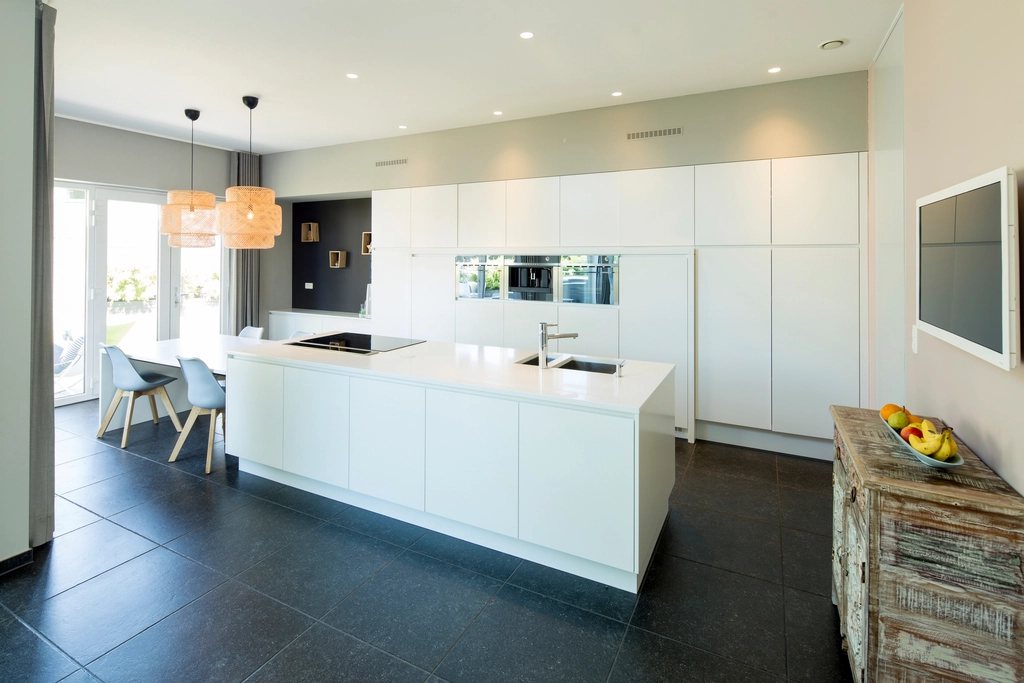
aspect-[16/9]aspect-[4/3]aspect-squareaspect-[4/5]
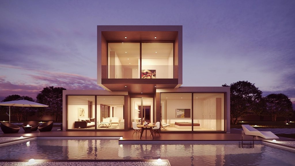
villa-dusk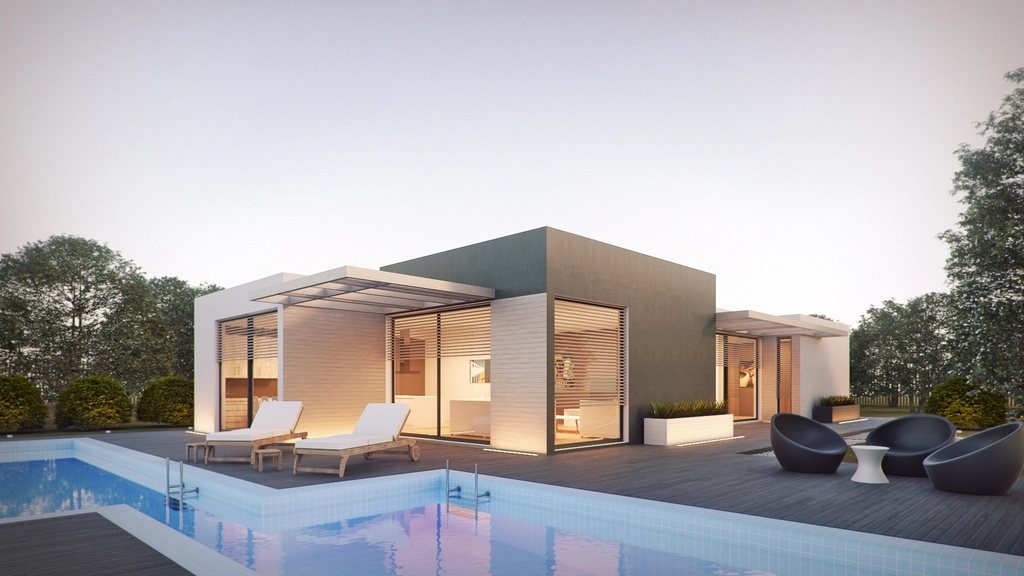
villa-pool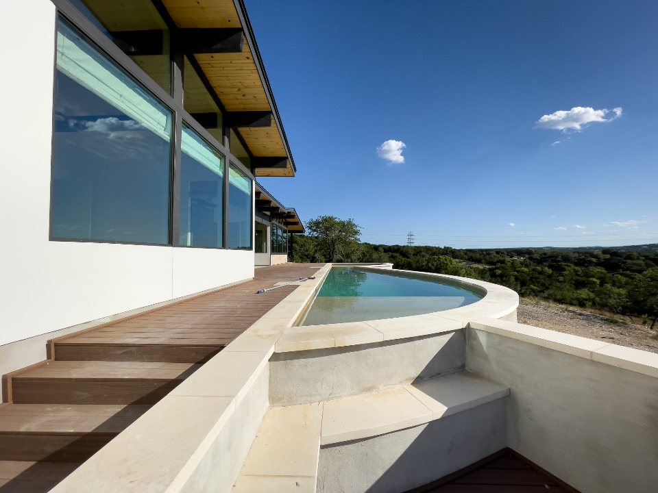
pool-terrace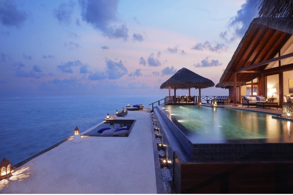
infinity-pool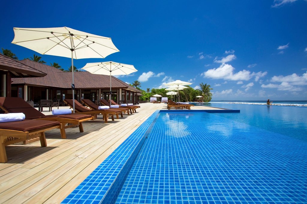
pool-deck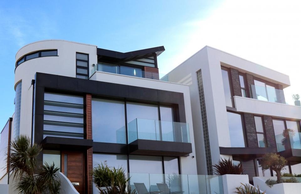
white-villacoast-house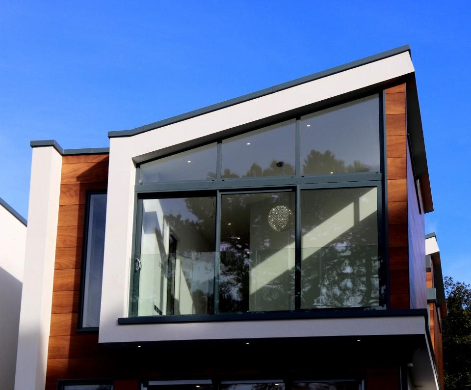
glass-gable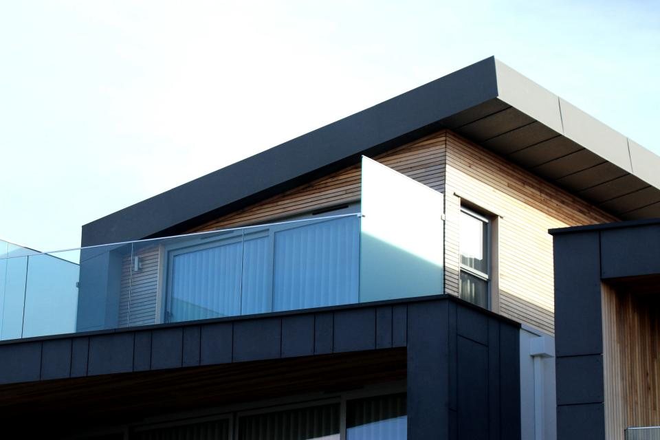
cantilever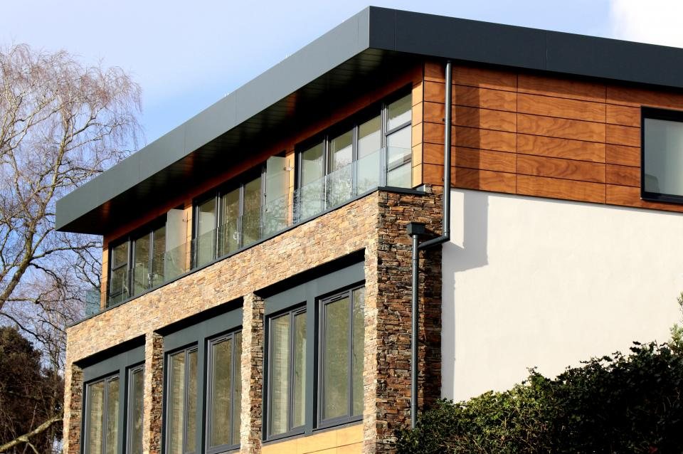
timber-house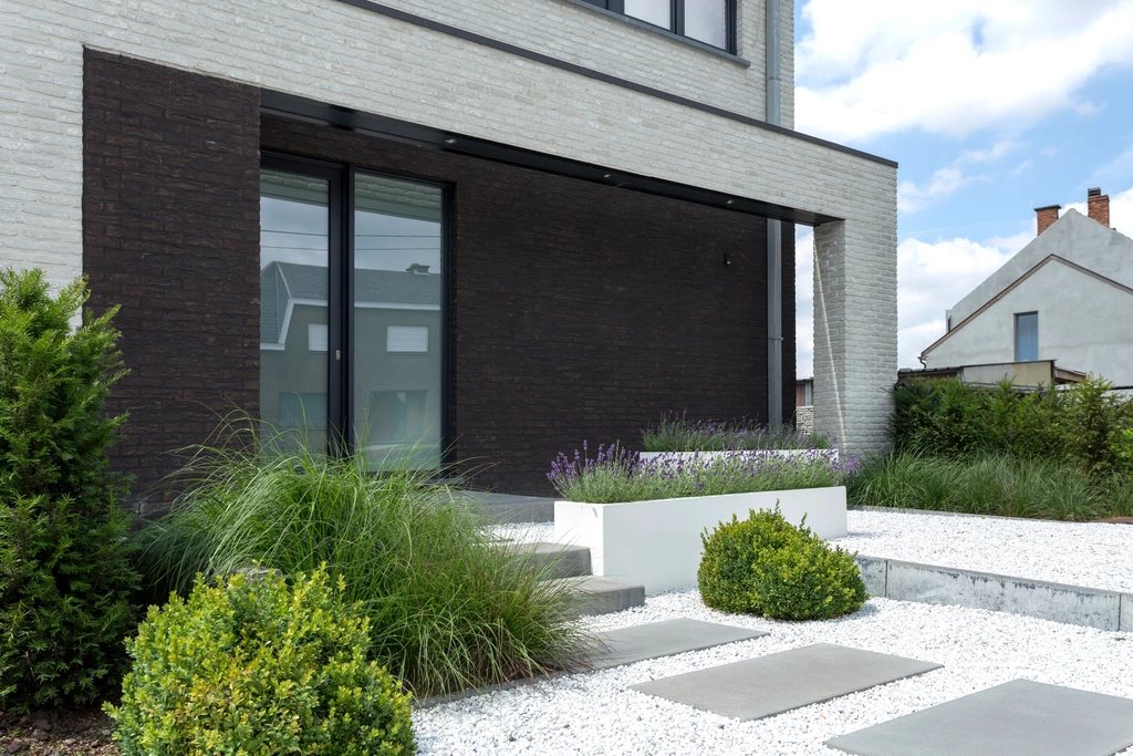
garden-house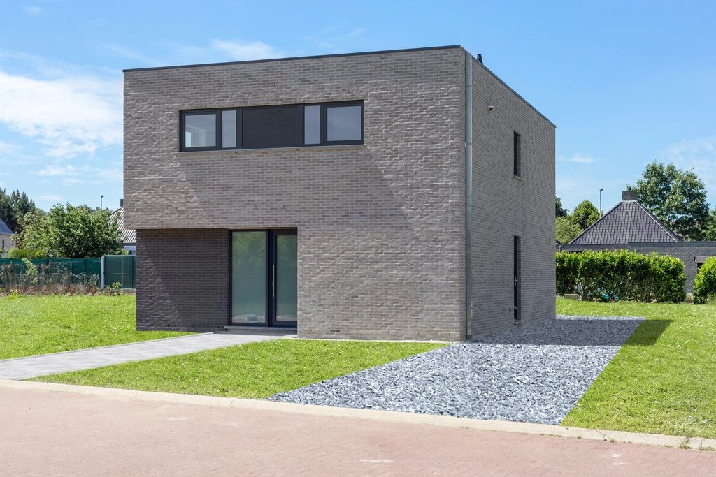
brick-cube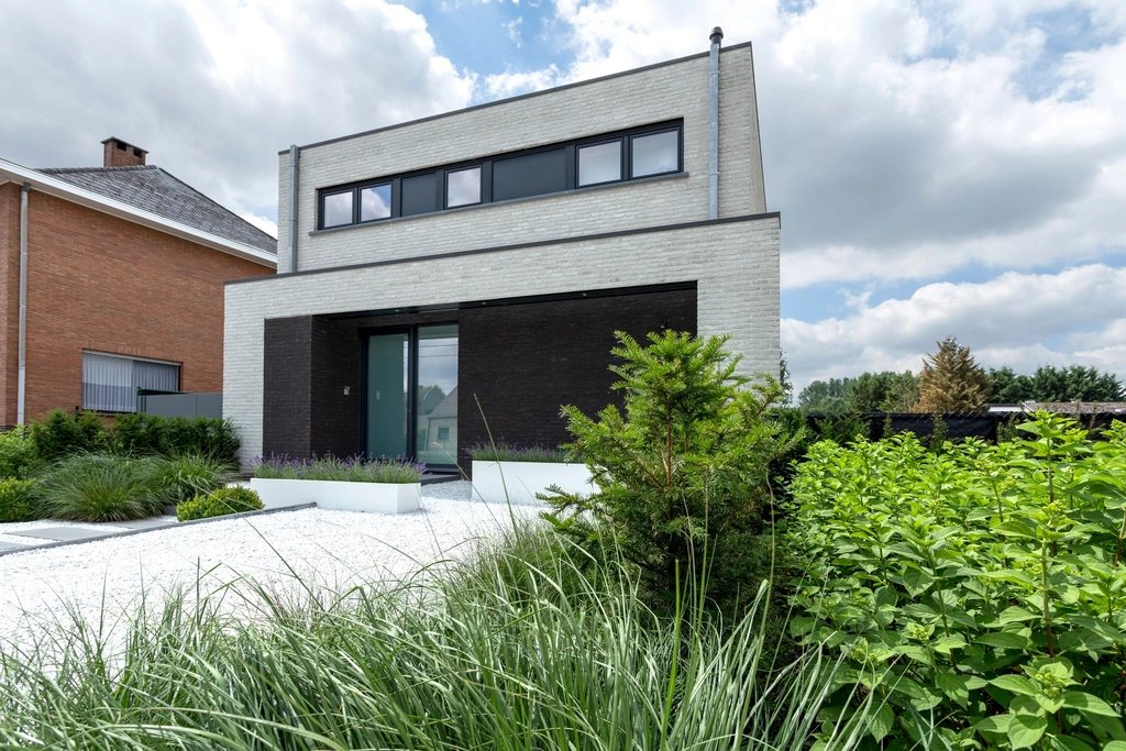
white-house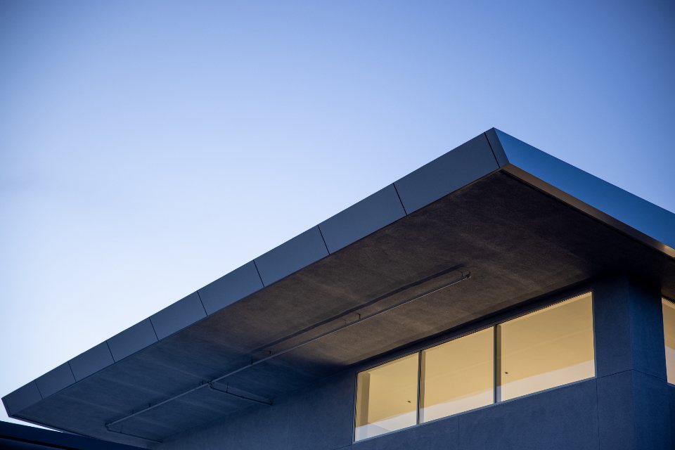
roof-edge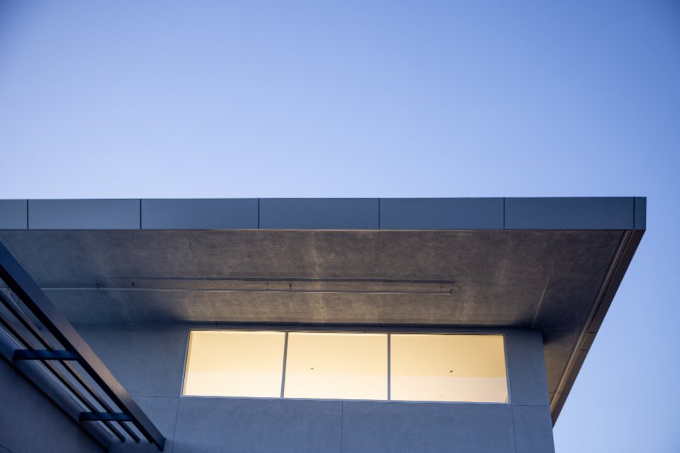
roof-light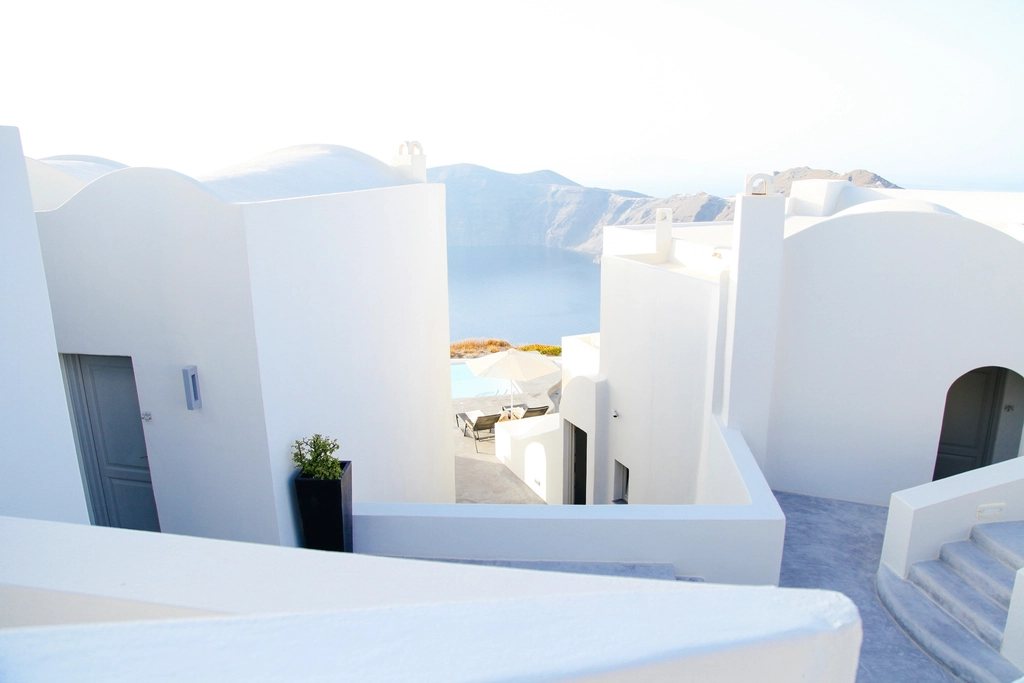
white-cubes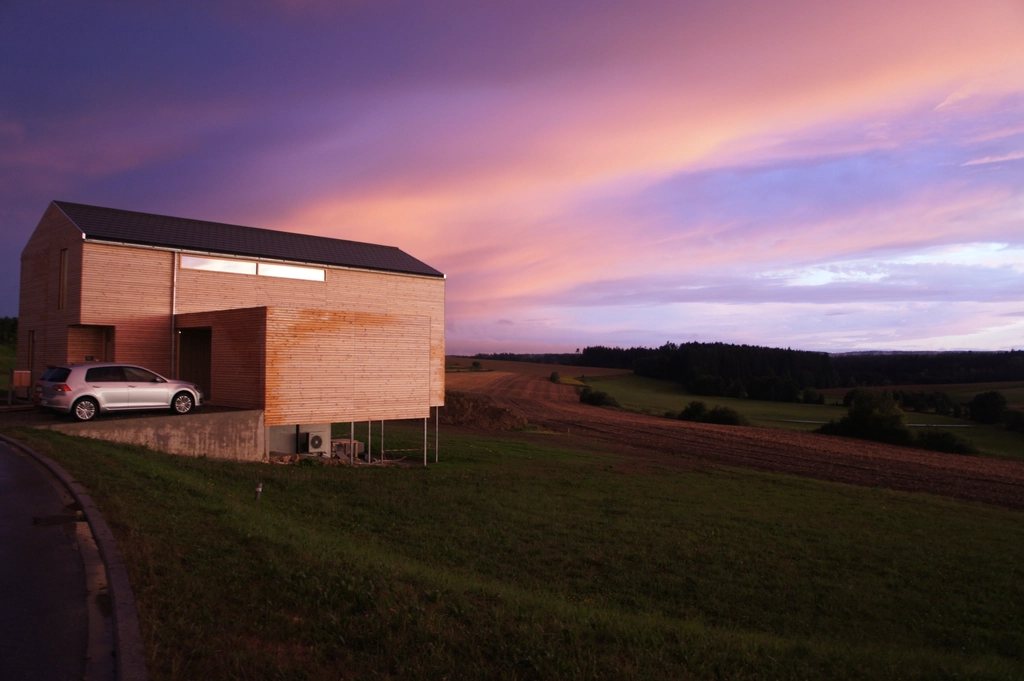
barn-dusk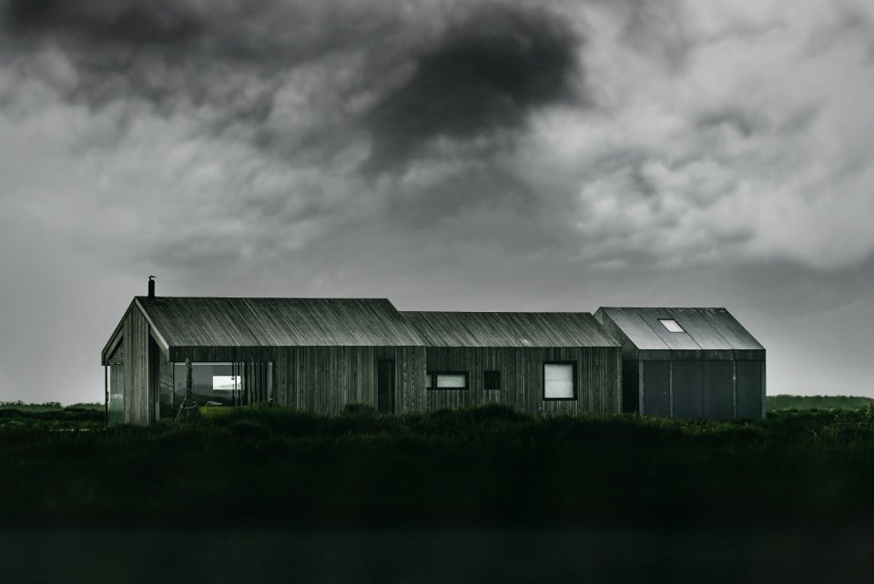
black-barn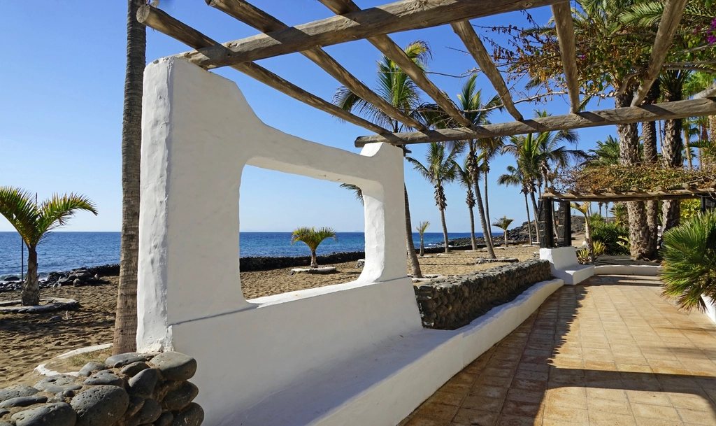
sea-wall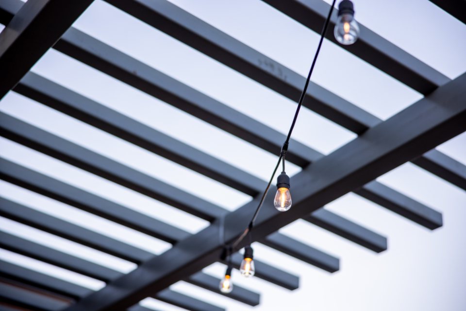
pergola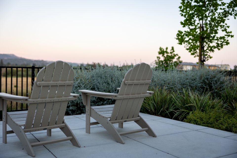
garden-terrace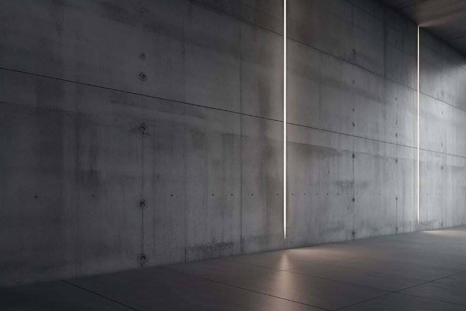
concrete-light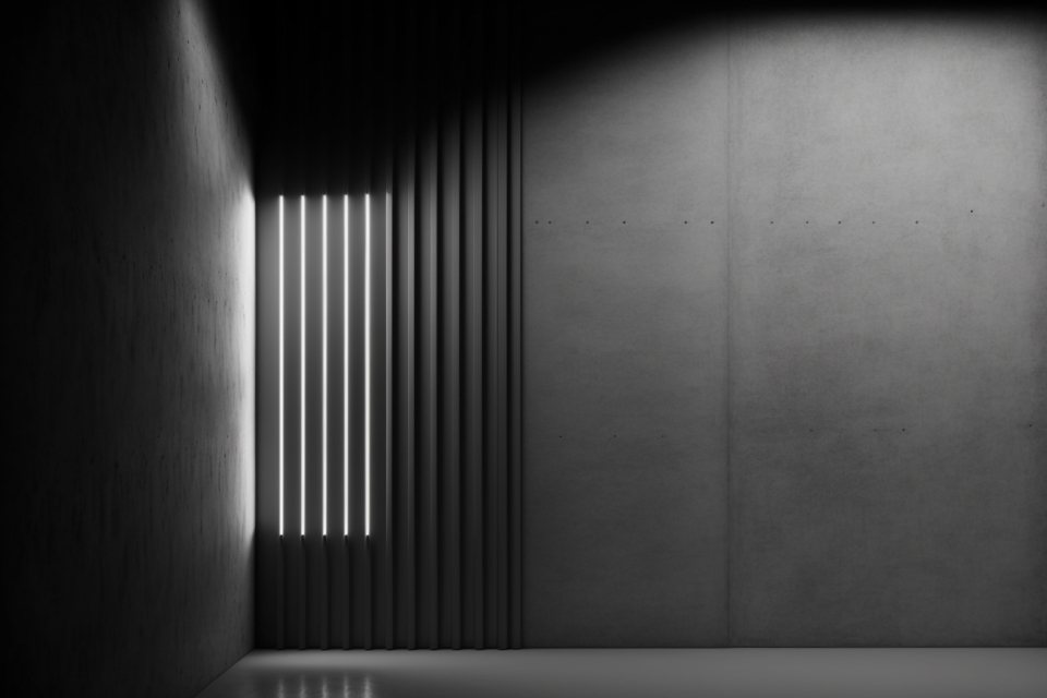
concrete-slits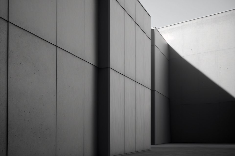
concrete-court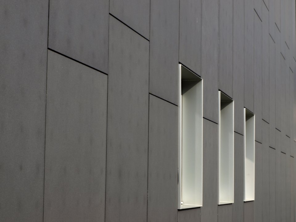
concrete-windows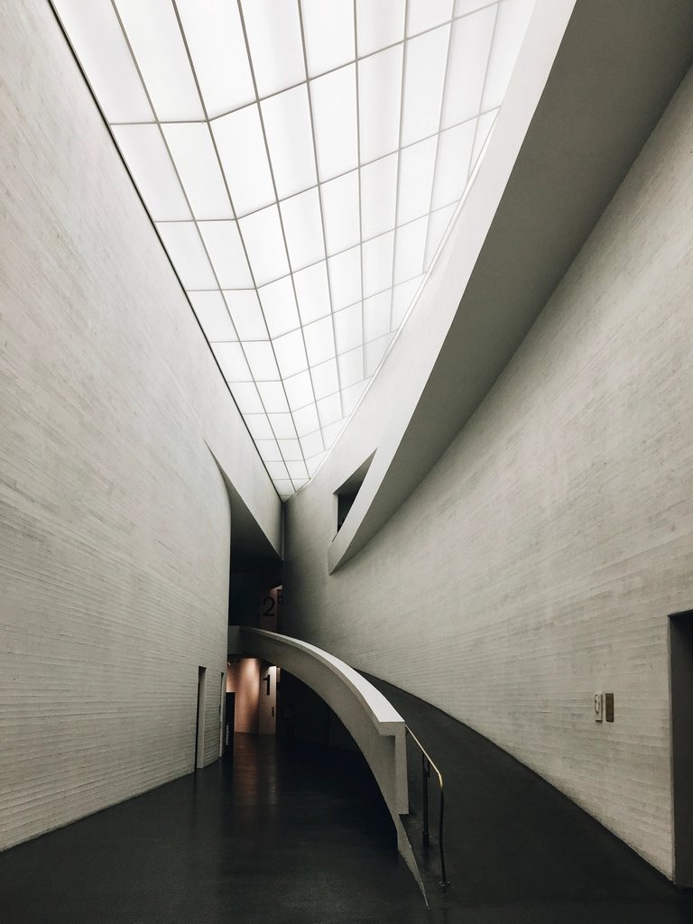
concrete-curve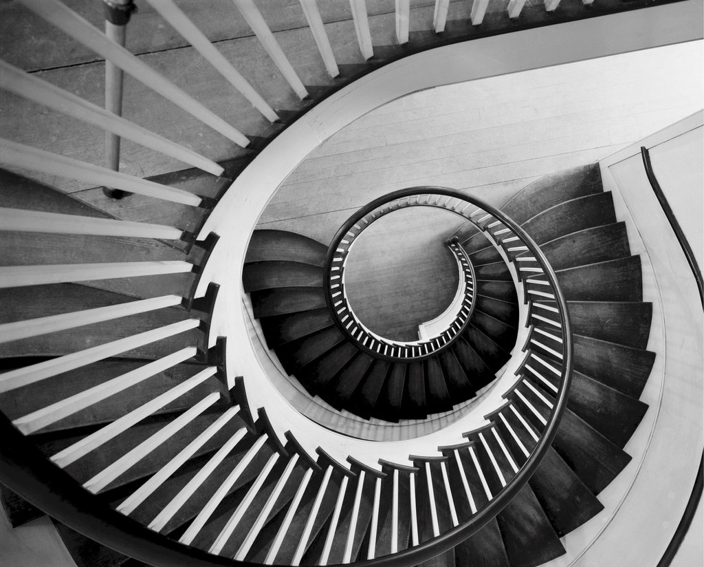
spiral-stair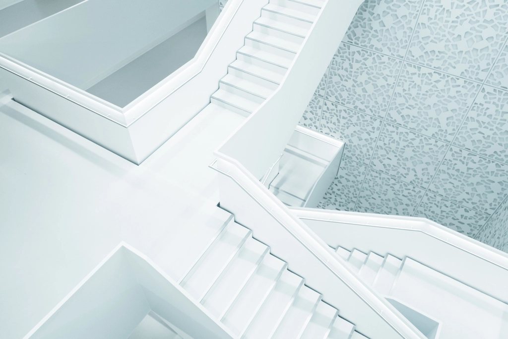
white-stair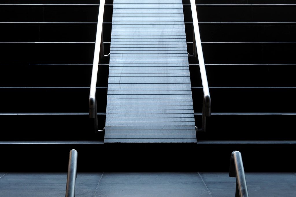
dark-stair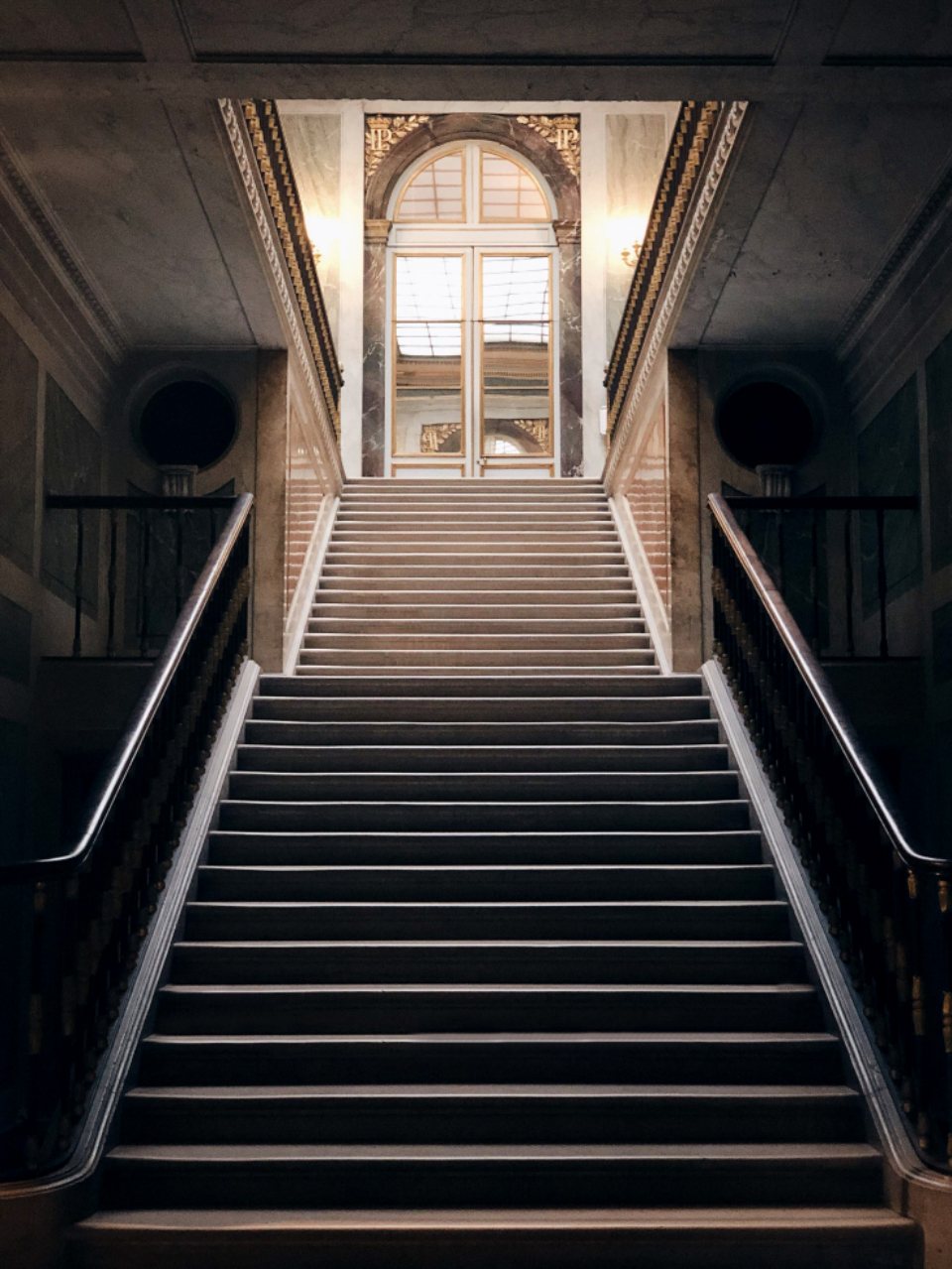
stair-hall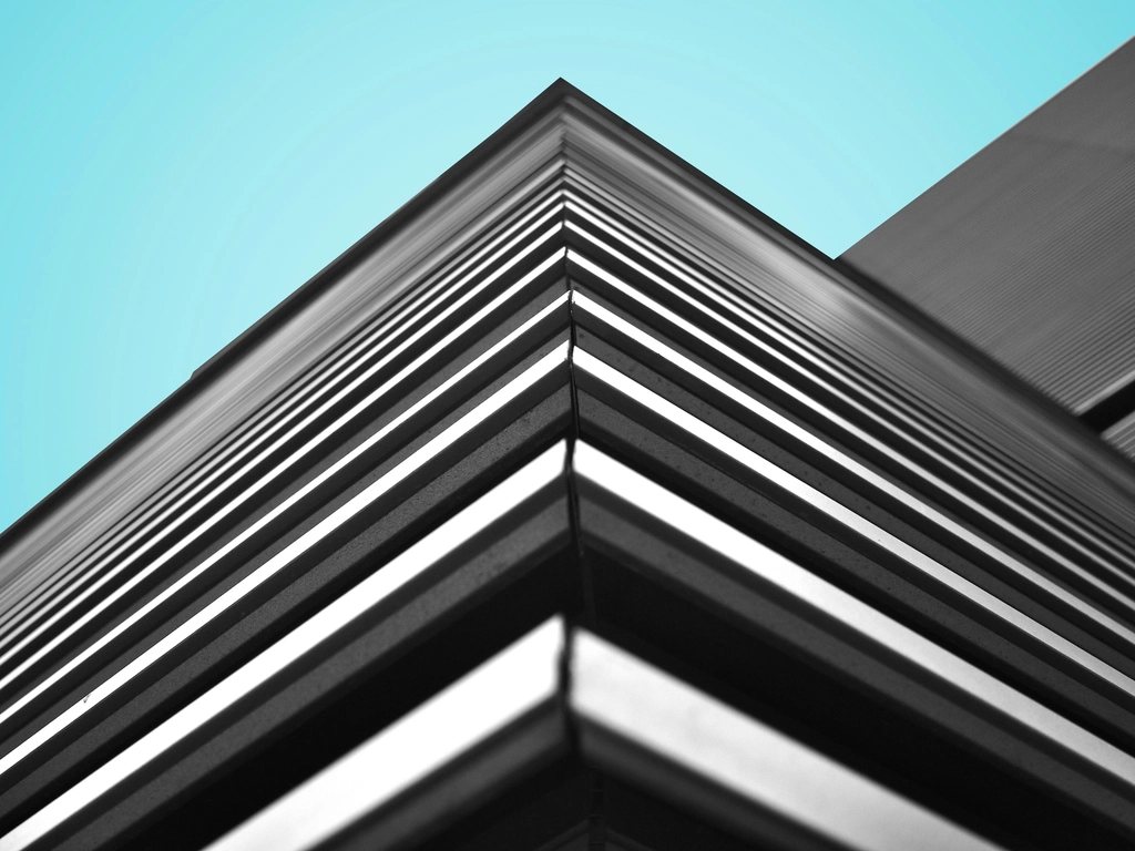
corner-lines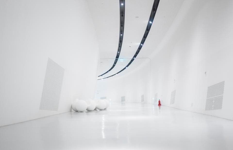
white-gallery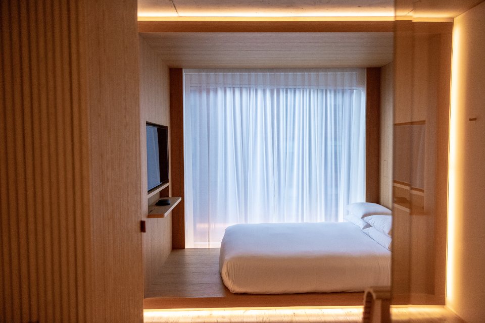
timber-bedroom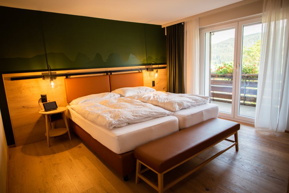
warm-bedroom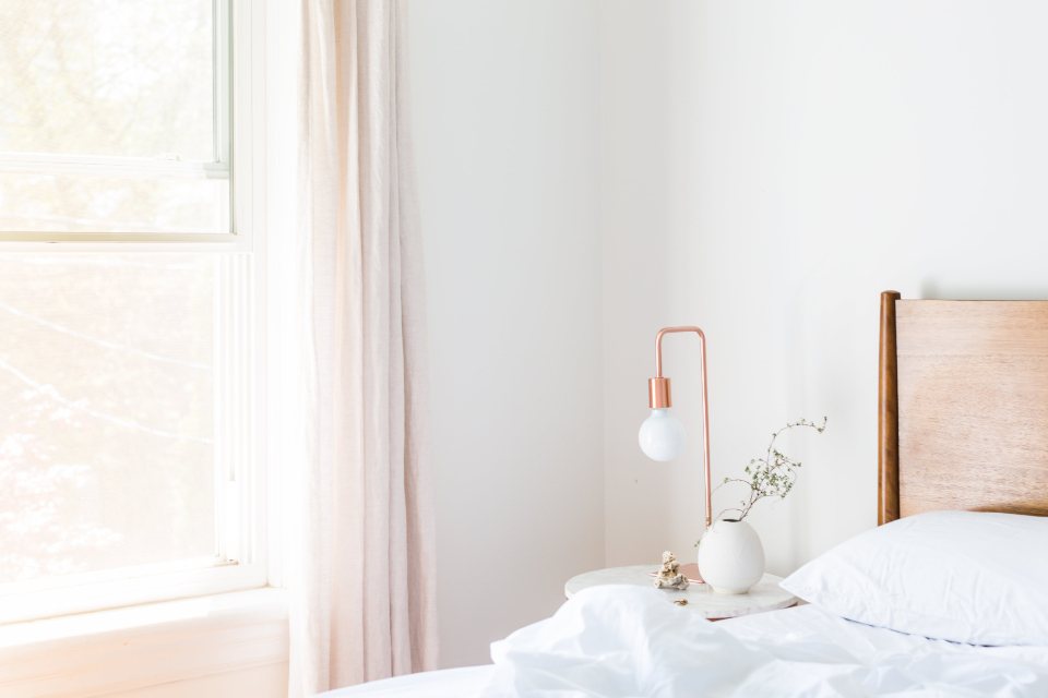
soft-bedroom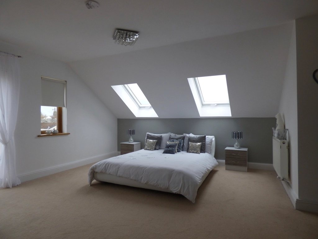
attic-bedroom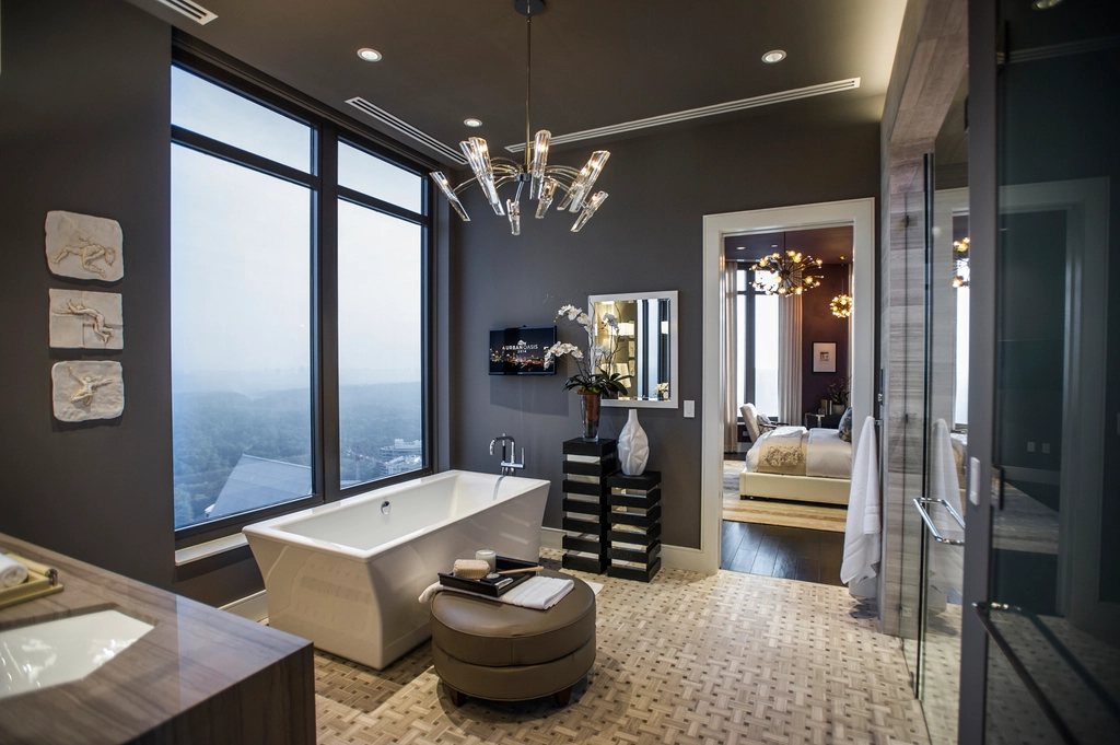
dark-bath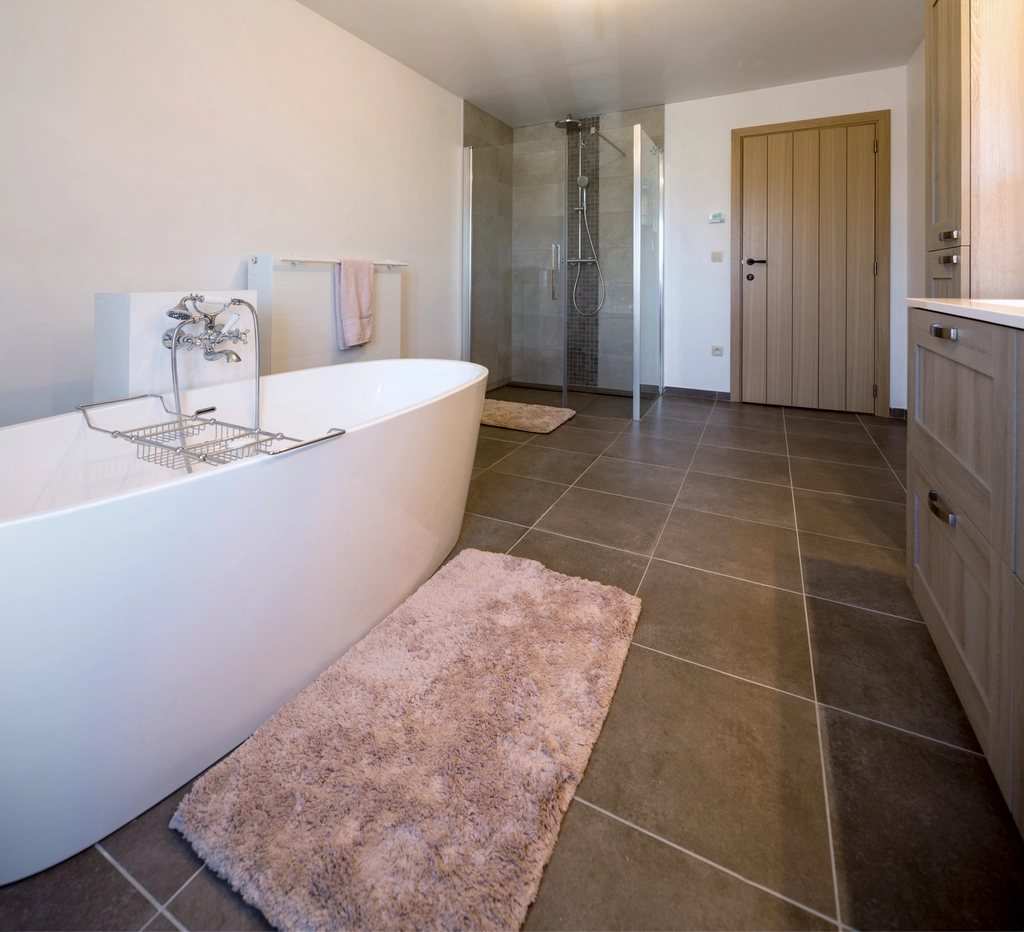
stone-bath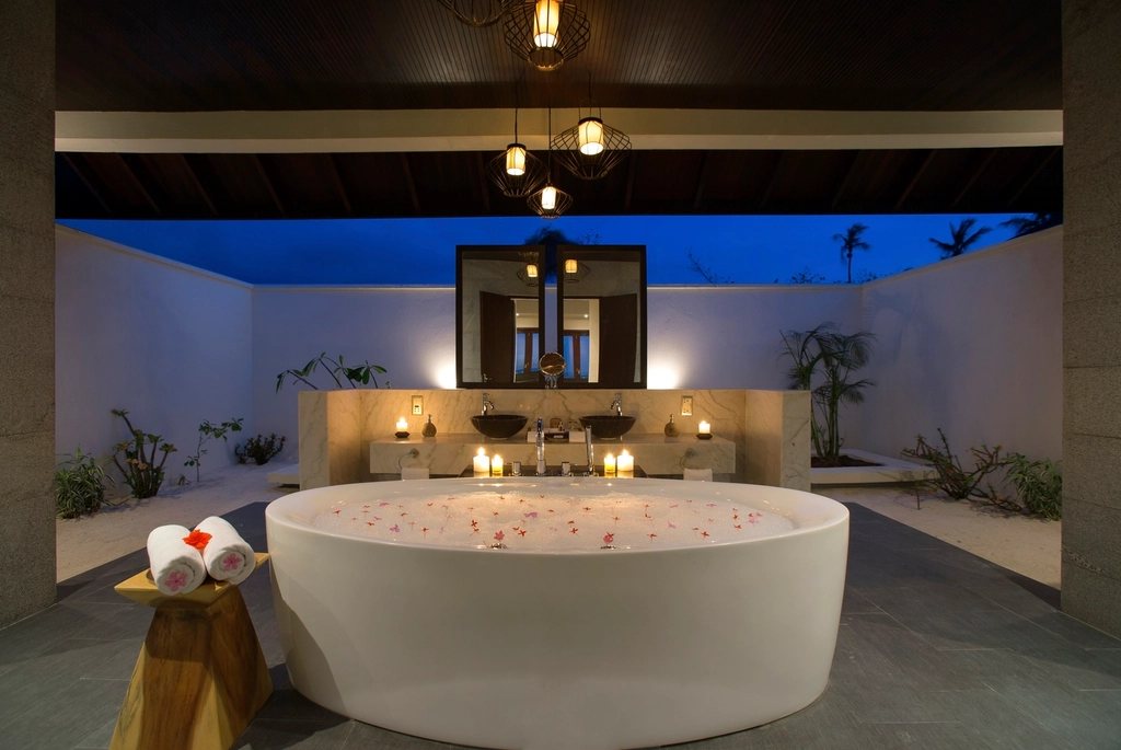
round-bath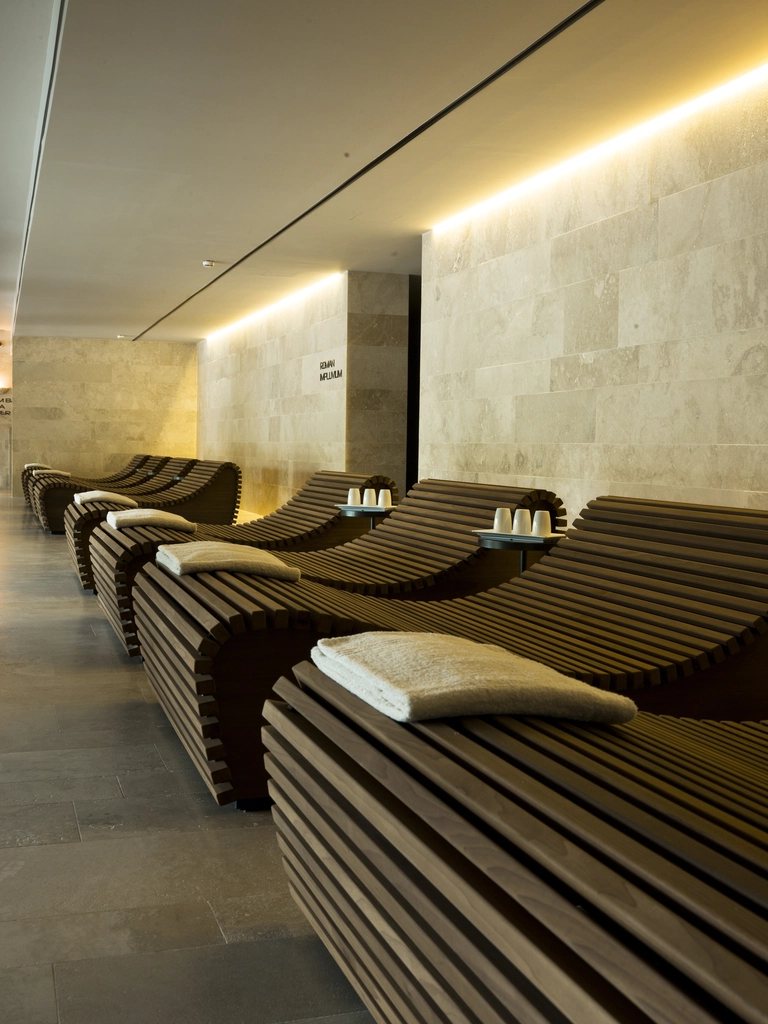
spa-loungers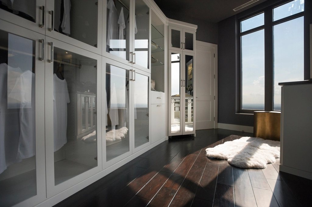
dressing-room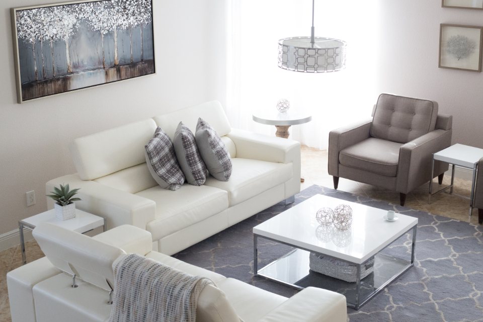
white-living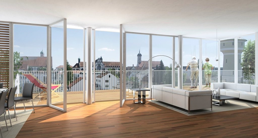
glass-living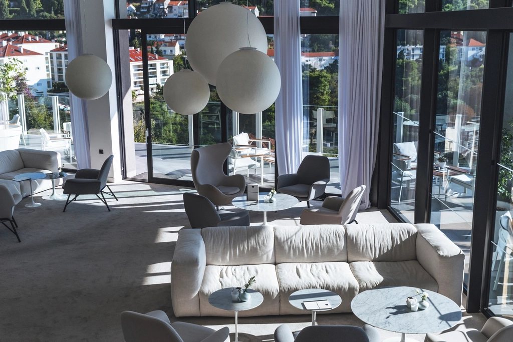
lounge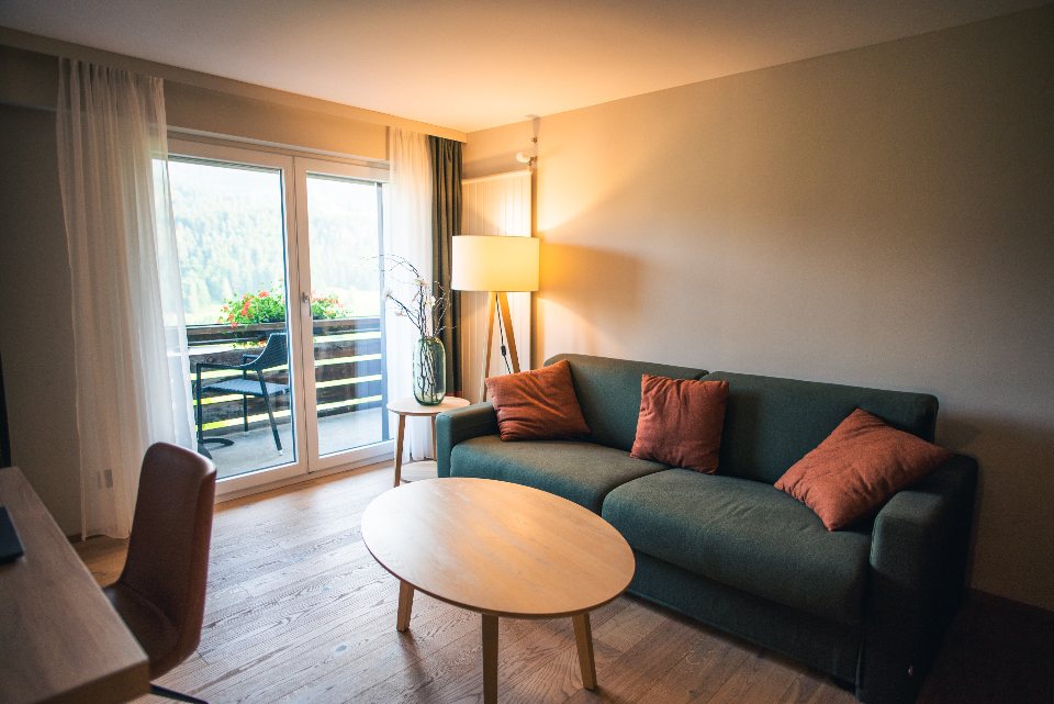
warm-living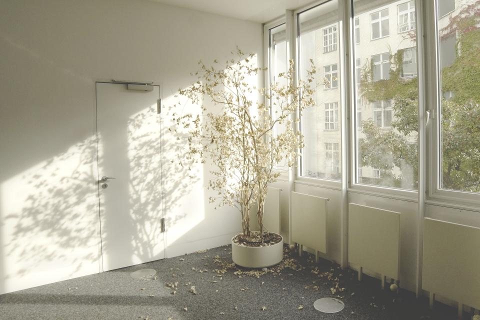
sunlit-room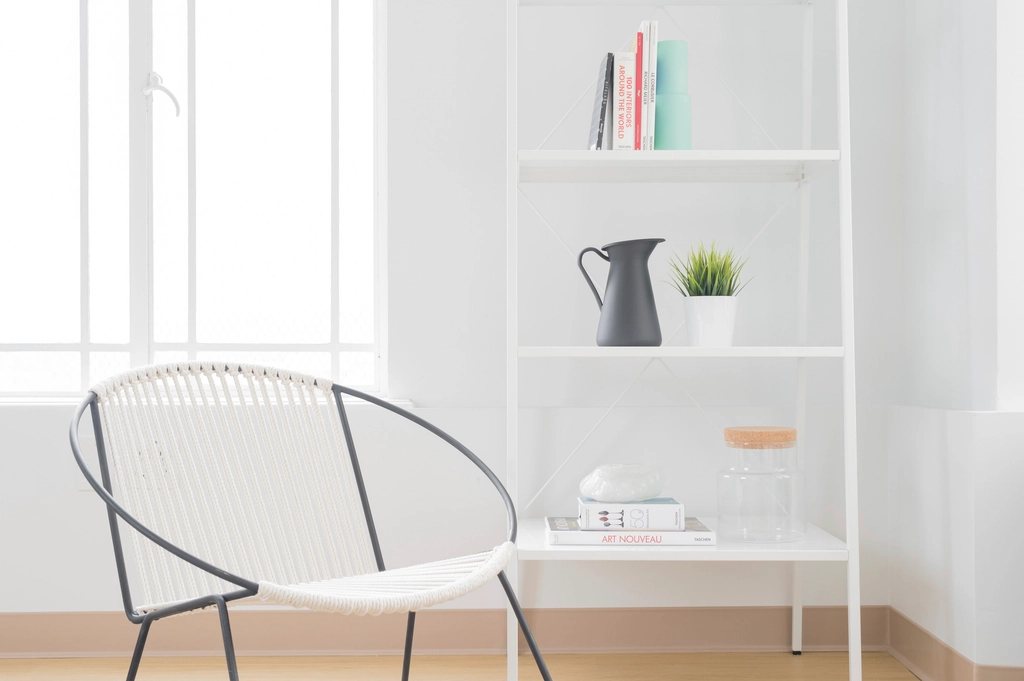
reading-corner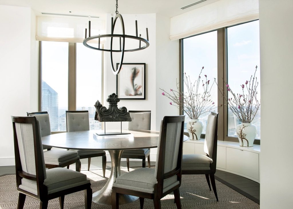
dining-view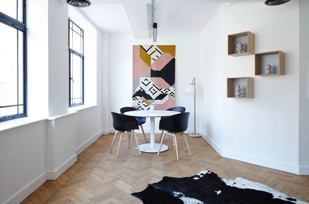
herringbone-diningwhite-kitchen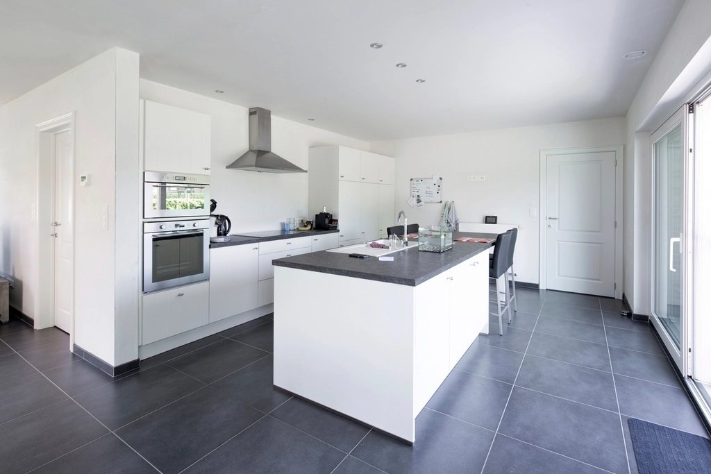
island-kitchen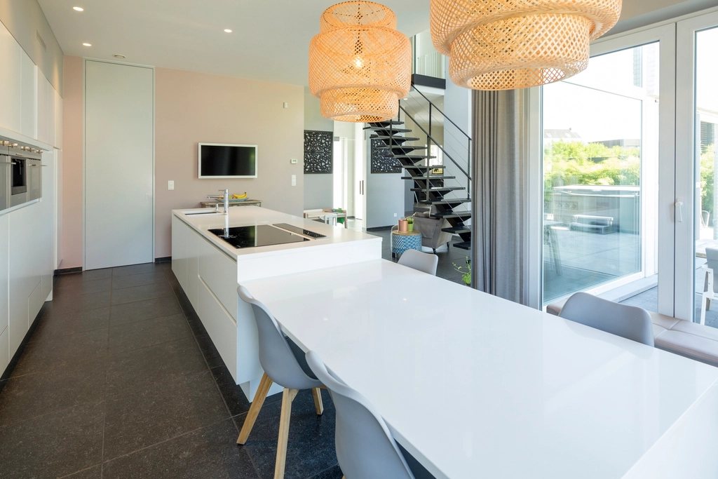
long-kitchen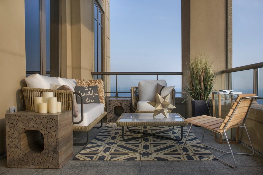
loggia
Cards & tiles
Bento grids on 12 columns with 12–16px gaps. Card, ink feature, accent feature and image tile.
Pattern · .panel / .tile in grid gap-3 md:gap-4Image tileCasa do ArcoComporta, PortugalMotion
Pure CSS. Tiles rise in as they enter the viewport, tickers loop, hovers ease out. Everything stops for reduced motion.
app/globals.css · .reveal · .marquee · ease-out-expo.revealScroll-driven, entry 0–60%, 40px rise + 0.98 scale.marquee40s linear loop, pauses on hover, two copiesease-out-expocubic-bezier(0.16, 1, 0.3, 1) for hovers
Architecture, Interiors, Furniture, Landscape